Cover Page
 This magazine cover is effective because it is eye catching
and quite professional. This is a good thing because in a work place, you like
to give of the image of it being a professional environment. The red masthead
links well with the colour of the girls top and this makes it aesthetically
pleasing. The bright background makes it look like college is a pleasant
environment because everybody loves the sun and green grass, which you can also
see in the background. The sell lines are effective because they are a different
colour from the anything else on the cover, so this makes them stand out and
your eyes are drawn to them. Also, the blue text links with the colour of her
shorts. The colour scheme is very simple but also effective. The main colours
are black and red, which is a good professional combination. The main image is
of an attractive student. This draws attention to the magazine because people
will see it and might want to read it and find out more about college life. The
whole cover page is worked around the main image. She is the centre of
attraction, even the masthead is put behind the main image. This shows the
importance of the main image and how much of a selling point it is. Another
reason for this cover page being successful is that only 4 different font
colours have been used, this is good because it makes it easy on the eye, so it
is not over crowded. Also, the main image is in focus, whilst the background is
blurred out so that your main focus is on the student.
This magazine cover is effective because it is eye catching
and quite professional. This is a good thing because in a work place, you like
to give of the image of it being a professional environment. The red masthead
links well with the colour of the girls top and this makes it aesthetically
pleasing. The bright background makes it look like college is a pleasant
environment because everybody loves the sun and green grass, which you can also
see in the background. The sell lines are effective because they are a different
colour from the anything else on the cover, so this makes them stand out and
your eyes are drawn to them. Also, the blue text links with the colour of her
shorts. The colour scheme is very simple but also effective. The main colours
are black and red, which is a good professional combination. The main image is
of an attractive student. This draws attention to the magazine because people
will see it and might want to read it and find out more about college life. The
whole cover page is worked around the main image. She is the centre of
attraction, even the masthead is put behind the main image. This shows the
importance of the main image and how much of a selling point it is. Another
reason for this cover page being successful is that only 4 different font
colours have been used, this is good because it makes it easy on the eye, so it
is not over crowded. Also, the main image is in focus, whilst the background is
blurred out so that your main focus is on the student.
I
find this magazine cover is not effective. My reasoning for this is that I
think it is very dull, and does not catch your attention in anyway at all. I
think the colour of the background makes this look like a very dark, gloomy
magazine and that there is nothing exciting about it. I also think that the
layout does not sell the magazine because it is very boring. The sell lines are
not interesting and the way they are laid out, they do not draw your eyes
towards them, so a lot of people would look straight past them and look at the
main image. I think the main image has a big part in this magazine cover. This
is because it is the only thing you notice when you look at it. Because of
this, it should be something that would sell the magazine, and shows that 'CAMPUS
LIFE' is not that bad and a good place to be; but what it actually shows is a
very dull looking man who does not sell the magazine. He is the centre of
attention but there is nothing that stands out. There are some positives to
come out of this magazine cover though. One of these is that the colour scheme
is very simple. Although it is very plain and boring to look at; it has not
been overdone and it is not hard to look at without getting lost. The colour of
the 'dallas green' in red matches the colour of the man’s shirt and this brings
the magazine together. One of the main features on a magazine cover is the
masthead. On this cover, the mast head is extremely dull and easily overlooked.
Personally, this magazine cover has no unique selling points and is not a very
good magazine cover.
Contents Page
 This contents page is not
very well laid out in my opinion. I think that it is too choppy and the edits
are not done very well. It does not look very appealing and it draws your
attention, but for the wrong reasons. It is very very basic and does not contain
enough content to fill up the page properly. It has used 3 images to fill over
half the page. The pictures do not represent education to be a good thing as
they are very boring and dull, for example the grey sky. No-one like’s bad
weather and it does not sell, so maybe they could have taken the pictures on a
brighter day and/or against a colourful background. A few positives about this
content page are the font and the colour scheme. The font goes well with the
style of the page; chilled out and modern. Also, the colour scheme is successful
because the black and the purple go well together, with a bit of green in one of
the pictures. The white text colour works well with both the black and the
purple as it stands out and it may catch your eye. Overall I think this contents
page needs to be brighter and needs to be laid out differently and broken up,
instead of all the pictures at the top and all the text at the bottom.
This contents page is not
very well laid out in my opinion. I think that it is too choppy and the edits
are not done very well. It does not look very appealing and it draws your
attention, but for the wrong reasons. It is very very basic and does not contain
enough content to fill up the page properly. It has used 3 images to fill over
half the page. The pictures do not represent education to be a good thing as
they are very boring and dull, for example the grey sky. No-one like’s bad
weather and it does not sell, so maybe they could have taken the pictures on a
brighter day and/or against a colourful background. A few positives about this
content page are the font and the colour scheme. The font goes well with the
style of the page; chilled out and modern. Also, the colour scheme is successful
because the black and the purple go well together, with a bit of green in one of
the pictures. The white text colour works well with both the black and the
purple as it stands out and it may catch your eye. Overall I think this contents
page needs to be brighter and needs to be laid out differently and broken up,
instead of all the pictures at the top and all the text at the bottom.
This contents page is a
successful one in my opinion. I think that the colour scheme of blue and white
works really well as they are easy to take it and are not too bright. A positive
of using white is that most colours will work with it, and it is not hard to
find a colour that matches, so this was clever by the designer of this contents
page. Another good feature is that they have a smaller version of what I think
is the cover page on the contents page. I think this is good because it fits in
well and also it is simple and it looks good. The layout is not very simple, but
it works. The font is a good suitable font to use with this style of magazine.
One negative of this contents page is that I think there is too much writing in
that little note. This could either be cut down, or put on another page, but I
do think that it fills the space quite nicely.
Fonts


I have chosen these 3 fonts because I think that all of them
look fairly professional and would work on a student magazine. The first one is
called 'Varsity'. This is a good one because it looks really neat and is very
suitable. The word 'Varsity' means college in America, so this is quite fitting
and works really well. I think the fact that it is squared off at all the edges
makes it look sharp and appropriate. The second font is a bit less formal but
still looks neat. This font is called 'Top Secret'. I think this is good for
the font because it looks like it is boxed in with the lines on top and
underneath the text. This font is quite modern, but it might not fit on a
student magazine which should be professional, not funky. The last font is
called 'Instruction'. This font is probably the most professional font out of
all of them but also the most boring out of the lot. It's very formal but may
not look right on a student magazine cover. After looking at all of these 3
fonts, I will most probably use 'Varsity' as it is the most fitting.
Layout

This is the plan of what my magazine cover should look like.
The masthead is where you would expect a masthead to be and does not break any
conventions. I have put the sell lines running down the side because you would
usually see sell lines scattered around on the edges of the page, but I am
putting them all on one side, so they are all in one place and you will most
probably read them all. The main image will be the back ground, but the person
in the main image will be in the open space and you will be able to see them.
The main story will be big and will be in the bottom right hand corner. I know
putting the main story in the bottom corner is a bit risky, but I will make
sure it stands out. The sub-stories and the gossip will have a little section
in the other bottom corner, while the slogan and logo will be in the top right
hand corner.
Images


These are the six images i have taken to use on my magazine cover. I think that these are all fairly good images because the person in the images is always dressed appropriately for a student magazine and his facial expressions are good. The quality of the pictures are very good! The one in the library, the lighting was not very good, so I will not be using that image. I think that the best two images are the last one and the fourth one, and I will use one of these two pictures on my final product.
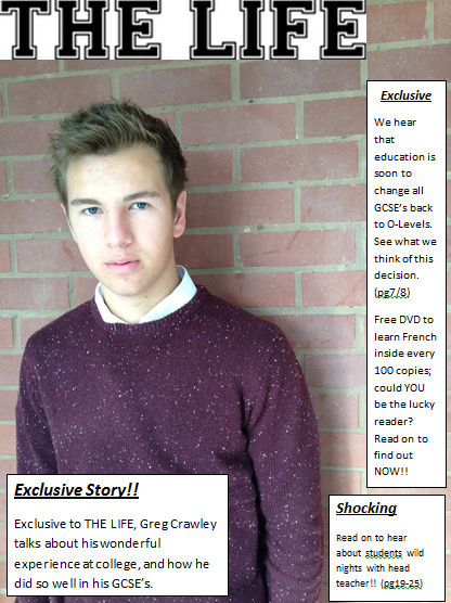
This is my magazine cover. This is not very good because you can see the texts boxs really clearly because i made it on word and could not make them transparent. A positive is that I stuck to the colour scheme that i wrote up about. Aslo, I think that the layout is very simple and clear, and is affective. Overall I do not think that this is an effective and good magazine cover.
Colour Scheme
The three main colours I am going to use are purple, white, and burgundy I will use these three colours because they will link quite nicely with the colour of the main image. The bricks, the jumper and the white collar. I am only using a colour scheme of 3 colours because if there is more, it will be too crowded and not look nice, so i have decided to keep it simple. This should be affective because it will be aesthetically pleasing.Magazine Cover

This is my magazine cover. This is not very good because you can see the texts boxs really clearly because i made it on word and could not make them transparent. A positive is that I stuck to the colour scheme that i wrote up about. Aslo, I think that the layout is very simple and clear, and is affective. Overall I do not think that this is an effective and good magazine cover.
No comments:
Post a Comment